Wedding Invitation Color Trends for 2026: The Palettes Setting the Tone (and the Ones Quietly Aging Out)
The soft neutral era is quietly expiring, and the couples who notice earliest will set the strongest first impression. This is the color forecast shaping digital wedding invitation design in the second half of 2026.
Color Is the First Impression Before the First Word
And right now, most digital invitations are making the wrong one.
Not wrong in an obvious way -- no one is using Comic Sans or clashing neons. The problem is subtler and, in some ways, harder to fix: couples are defaulting to palettes that feel safe, refined, and tasteful… for 2021. Dusty rose. Eucalyptus green. Warm ivory with sage ribbon. These combinations still circulate because they photograph well and no one objects to them. But 'no one objects' is not the same as 'this feels current,' and guests notice the difference even when they cannot name it.
Color communicates before a single line of copy is read. It signals the decade the couple is living in, the level of intention behind the event, and the emotional register guests should arrive in. If your invitation palette is five years behind the cultural moment, you have already set a weaker expectation than the wedding deserves.
This is Wedwebs' color forecast for the second half of 2026, and it comes with strong positions.
The Era That Is Ending: Blush, Sage, and the Soft Neutral Complex
Dusty rose and eucalyptus green had a remarkable run. They emerged from a specific cultural appetite -- post-maximalist, Instagram-legible, universally inoffensive -- and they served that moment well. The problem is that the moment has passed.
The soft neutral complex (blush, sage, warm taupe, greige) peaked somewhere between 2019 and 2022. It is now the visual equivalent of a wedding Pinterest board that has not been updated. Couples who choose it today are not making a timeless choice -- they are making a dated one while believing they are making a safe one. That gap between intention and perception is exactly where first impressions fracture.
If your digital invitation could have been sent in 2021 without anyone noticing, it is time to reconsider the palette.
The New Directions: Four Palettes Defining 2026
Deep Espresso and Warm Cream
Rich, near-black brown grounds paired with warm ivory or aged cream. This combination draws from interior design's current obsession with dark, enveloping rooms -- the kind you find in boutique hotels in Marrakech or Melbourne's emerging dining scene. On an invitation, it communicates sophistication without coldness.
The typography philosophy that serves it: high-contrast serif type, generous letter-spacing on display lines, and restraint. One font family, two weights. The warmth of the brown prevents the palette from reading as corporate or severe, while the cream keeps it from feeling heavy.
What it signals to guests: 'This evening will be considered, unhurried, and worth dressing for.'
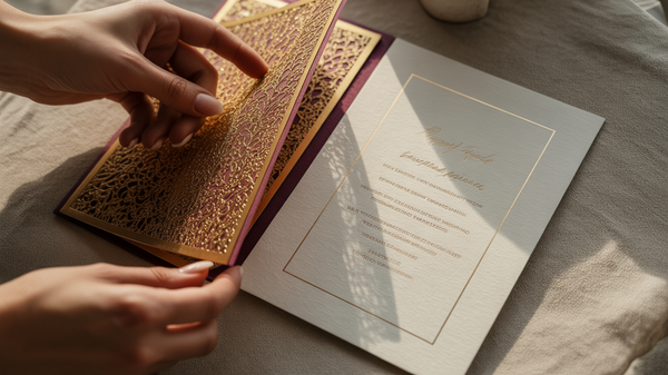
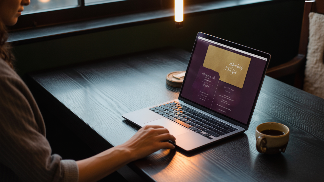
Midnight Plum and Antique Gold
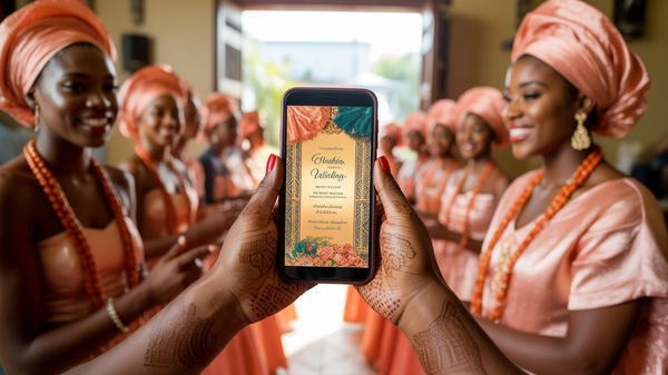
Deep violet-adjacent purples -- not bright, not pastel, but the color of a wine-stained tablecloth in good lighting -- paired with muted antique gold rather than bright metallics. This palette carries ceremony. It is the direction for couples whose weddings have genuine ritual weight, whether that is a Yoruba traditional in Lagos, a Hindu ceremony in Dubai, or a civil dinner in Paris.
Typography here earns ornamentation: calligraphic scripts paired with a clean modern serif for contrast. Gold foil-effect line work, monogram motifs, and structured composition. The layout should feel like a document of importance, not a lifestyle flat-lay.
What it signals to guests: 'You are being invited into something that matters.'
Terracotta, Ochre, and Raw Gold
Earth tones are not new, but the specific register has shifted. The terracotta of 2023 was warm and approachable. The terracotta of 2026 is deeper, rawer, and paired with ochre yellow and unpolished gold -- the color language of handmade ceramics, desert architecture, and artisanal craft. Think the sun-baked walls of Rajasthan or the pottery markets of Oaxaca translated into invitation design.
This palette suits outdoor weddings, destination events, and couples who want warmth without sweetness. Typography is slightly imperfect: hand-lettered display scripts, linocut-inspired texture, layouts that breathe asymmetrically.
What it signals to guests: 'This will be beautiful in a way that feels real, not staged.'
Glacial Sage and Cool White
This is where the sage era goes next. Not the warm, olive-adjacent eucalyptus of recent years -- instead, a cooler, greyer, almost mineral green that reads more like sea glass than garden foliage. Paired with cool white and silver or slate accents, it is clean without being minimal, refined without being cold.
The typography pairing: fine-weight modern serifs, wide margins, and compositional restraint. Glacial sage rewards white space. The invitation should feel like the first page of a very well-edited book.
What it signals to guests: 'Elegance here is effortless, not effortful.'
Why Palette Choice Is a Guest Experience Decision
The invitation is not decoration. It is the opening move of the guest experience -- the moment a couple establishes the emotional contract with everyone attending. A palette communicates the venue's probable atmosphere, the dress code's probable weight, and the overall tone the evening will hold.
When the invitation says 'intimate terracotta warmth' and guests arrive at a corporate ballroom in fluorescent light, the dissonance is felt even if it cannot be named. When the midnight plum invitation delivers a ceremony with genuine ceremony, guests arrive already emotionally calibrated for it.
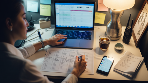
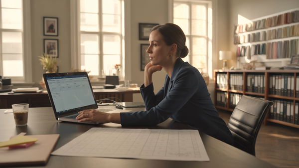
For Wedding Organizers, this is the argument for treating digital invitation design as a strategic decision rather than a vendor line item. A well-chosen palette earns trust from the first open. A mismatched one creates a quiet doubt that follows guests into the room.
The couples choosing these directions in 2026 are not just picking a color. They are making a promise about the standard of the event to come -- and every design element in the invitation, from the typeface weight to the composition margins, should be built to keep it.
If you are building a wedding in the second half of 2026, or advising couples who are, Wedwebs' portfolio reflects exactly these directions. Explore our current design work or reach out to discuss a custom project built around a palette that sets the right expectation from the first impression.