Two Aesthetics, One Suite: The Design Philosophy Behind Cross-Cultural Wedding Invitations
Cross-cultural wedding invitations fail when studios try to blend two traditions into one compromise. Controlled contrast is the design principle that honors both without diluting either.
Two families. Two aesthetics. One invitation. The design challenge that separates studios from templates.
When a bride raised on Mughal miniatures and a groom shaped by Scandinavian restraint decide to marry, every design decision becomes a negotiation between worldviews. This is not a niche problem. Cross-cultural weddings are one of the fastest-growing wedding categories globally -- in Sydney, Toronto, Dubai, and Lagos alike. And the invitation suite is the first place where both families see whether their traditions have been honored or erased.
Most studios handle this badly. They either blend everything into a beige compromise that satisfies no one, or they split the suite into two separate cards that feel like a divorce announcement. Neither is a solution. The principle that actually works is what we call controlled contrast.
What Controlled Contrast Actually Means
Controlled contrast is not about splitting a layout in half. It is about understanding which visual elements carry cultural weight and which ones are neutral enough to serve as connective tissue between two distinct traditions.
Every design tradition has what we might call 'load-bearing elements' -- the motifs, colors, and compositional rules that, if removed, make the tradition unrecognizable. In Mughal-inspired design, those are gold filigree, architectural arches, and a density of pattern that signals abundance and celebration. In Scandinavian minimalism, the load-bearing element is negative space itself -- the deliberate emptiness that creates calm and clarity.
Controlled contrast means preserving both sets of load-bearing elements without forcing them to compete for the same real estate on the page.
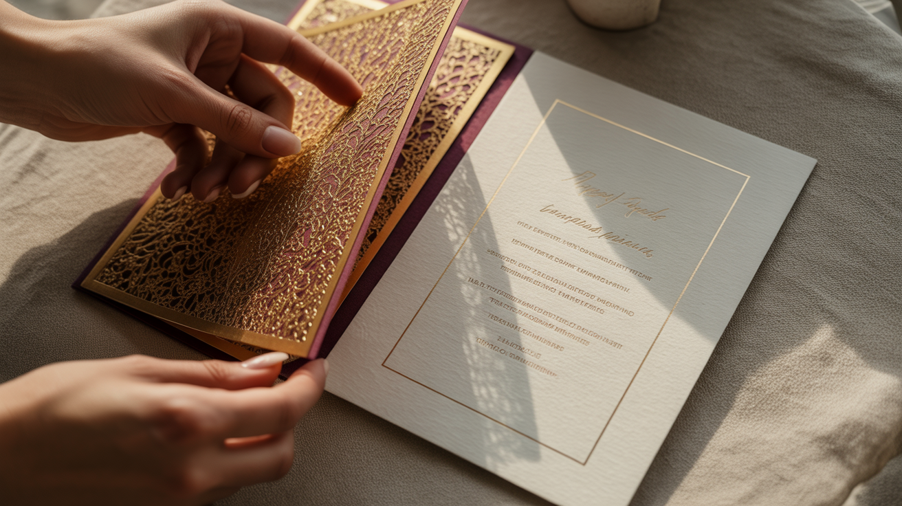
Mughal Filigree Meets Scandinavian Whitespace
Consider a suite for an Indian-Swedish wedding. The instinct is to scatter gold across a white card and call it fusion. That is not fusion -- it is dilution.
The more precise solution is compositional separation with material unity. The outer envelope liner carries the full weight of the Mughal vocabulary: a deep jewel-toned ground, intricate jali-pattern filigree in 22k gold foil, layered borders that reward close inspection. Inside, the invitation card itself breathes. A single fine-line gold rule. Generous margins. A serif typeface set at a size that feels unhurried. The cultural information -- ceremony names, ritual timings, family names in Devanagari and Swedish -- presented with the same unhurried confidence as a Scandinavian art catalogue.
The two pieces exist in dialogue, not in conflict. Neither family opens that envelope and feels their tradition was the 'other' one.
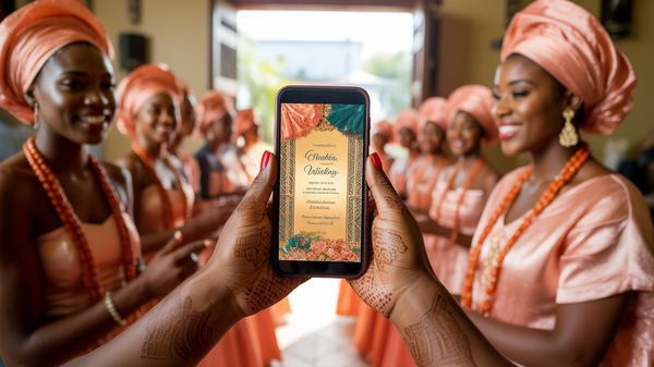
Ankara Geometry and Wabi-Sabi Texture
A Nigerian-Japanese pairing asks a different question entirely, because both traditions are actually rich in pattern -- they just use pattern differently.
Ankara prints are declarative. The geometry is bold, the colors are high-contrast, and the repetition is meant to be read from across a room. Japanese wabi-sabi aesthetics, by contrast, find beauty in irregularity, impermanence, and the evidence of a hand. The texture of handmade washi paper. An ink brushstroke that is intentionally not perfect.
The bridge here is materiality. Printing a bold Ankara-inspired geometric border onto washi paper -- a surface that is itself an expression of wabi-sabi -- creates a sensory experience where both traditions are present simultaneously rather than sequentially. The graphic boldness of the pattern lands differently on a surface with visible fiber and gentle tooth. It softens without weakening. The washi absorbs the color slightly, giving the palette a warmth that neither tradition would have produced alone.
Design as Cultural Diplomacy
The framing matters as much as the execution. A cross-cultural invitation suite is not a design exercise in 'making things match.' It is an act of cultural diplomacy -- a designed object that tells both families, before a single word is read, that this union is being held with equal care on both sides.
That requires a studio with genuine aesthetic literacy, not a template library with a color-picker. It requires knowing that negative space in a Scandinavian context communicates sophistication, while the same space in a West African context can read as emptiness -- and knowing how to calibrate the balance so both readings are honored. It requires treating the invitation suite as architecture: structure first, ornament in service of the structure.
When the design is done right, something remarkable happens. Guests who have never met each other open the same envelope and see something of themselves inside it. The invitation has already done the work of the wedding -- it has brought two worlds into the same room.
If you are planning a cross-cultural wedding or building an invitation offering for multicultural clients, we would genuinely enjoy seeing what you are working with. Explore the Wedwebs portfolio or bring us into your next project -- the more complex the brief, the more interested we are.