Serif Typography Is Back -- And It Is Redefining Digital Wedding Invitations
Script fonts are losing ground to serif typography in premium digital wedding invitations -- and there is a strong design reason why. This breakdown of three expert font pairings shows exactly how type choice shapes a guest's first impression before a single word is read.
Your Font Speaks First
Your invitation font is talking before your guests read a single word. What is it saying?
If the answer is 'flowing script in a dusty rose,' you are not alone -- but you are also not ahead. The script font era served a purpose. It felt personal, romantic, handcrafted. But on a 390-pixel mobile screen, at 11pm, when your guest is squinting at their notification, that swirling calligraphy becomes noise. Elegant noise, maybe. But noise.
Serif typography is making a decisive return in digital wedding invitations, and the studios paying attention are already using it to separate their work from the rest of the market.
Why Serifs Win on Mobile
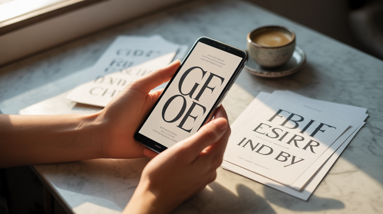
There is a persistent myth that serifs belong on printed pages and sans-serifs belong on screens. That was a practical truth in the era of 72dpi monitors. Modern retina displays render serif letterforms with the same crispness you would expect from a printed editorial spread.
What serifs carry that scripts cannot is structural authority. The small terminals at the baseline of each letter create a horizontal reading rhythm that guides the eye forward. On a mobile invitation where a guest might spend 8 to 12 seconds scanning for date, venue, and RSVP link, that rhythm is not decorative -- it is functional. Script fonts ask the reader to slow down and appreciate. Serifs ask them to keep moving, effortlessly.
Beyond legibility, there is something serifs do at a subconscious level that no script font can replicate: they signal editorial intention. A couple that chooses a well-set serif headline is communicating -- before a single detail is read -- that this wedding has been considered, curated, and designed with taste.
Three Serif Pairings Worth Using Right Now
Didot + Karla
Didot is the typographic equivalent of a Parisian couture house. Its extreme contrast between thick and thin strokes reads as high fashion, architectural, and deliberately luxurious. Pair it with Karla -- a humanist sans-serif with generous spacing and slightly soft geometry -- and you get an invitation that feels like it belongs in a Condé Nast editorial spread. Use Didot at large display sizes (48px and above) for the couple's names, and Karla for all body copy and detail lines. This pairing communicates: black-tie, international, design-literate. It suits couples hosting events in spaces like rooftop venues in Dubai or heritage ballrooms in Sydney.
Playfair Display + Source Sans Pro
Playfair Display carries old-world weight with a contemporary sharpness -- it was designed specifically for high-resolution screens, which makes it one of the most technically reliable serif choices available. Source Sans Pro is a workhorse: neutral, clean, reads at any size. Together, this pairing achieves something rare: warmth and formality at the same time. It is the right choice when the couple wants to signal sophistication without intimidation -- a garden wedding in Cape Town, a multicultural ceremony in Toronto where guests span three generations and two continents. Playfair sets the tone. Source Sans makes the RSVP link feel approachable.
Cormorant Garamond + Montserrat
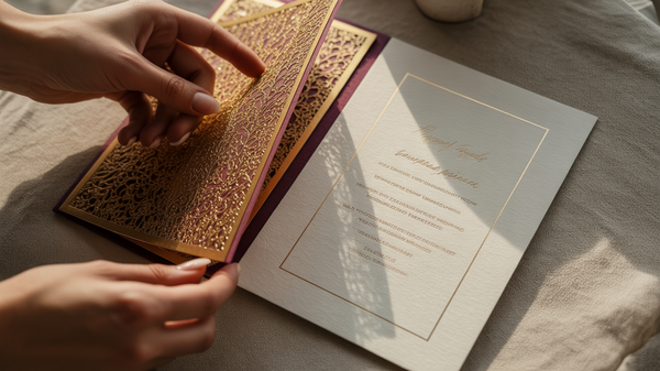
Cormorant Garamond is operatic. Its letterforms are drawn from 16th-century type specimens, and it carries that history in every stroke -- delicate, elongated, almost sculptural. Paired with Montserrat, a geometric sans-serif built on clean circles and straight lines, the contrast becomes the design. The tension between the old and the modern is not a problem to solve; it is the aesthetic. This pairing works best for couples staging weddings that are intentionally theatrical -- a heritage villa in Tuscany, a multi-day South Asian ceremony where the invitation itself is expected to feel like an artifact. Set Cormorant Garamond at generous line heights (1.6 to 1.8) and let it breathe.
The First Impression Is the Reputation
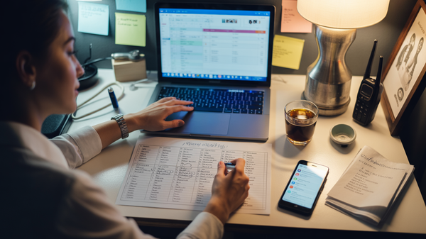
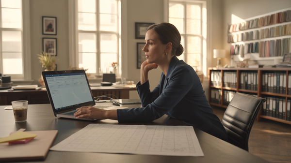
For a Wedding Organizer, the typography choice on a digital invitation is a positioning statement for your studio's taste level. Clients do not always know the name of the font you chose. They do know whether the invitation felt premium or generic within the first two seconds of opening it.
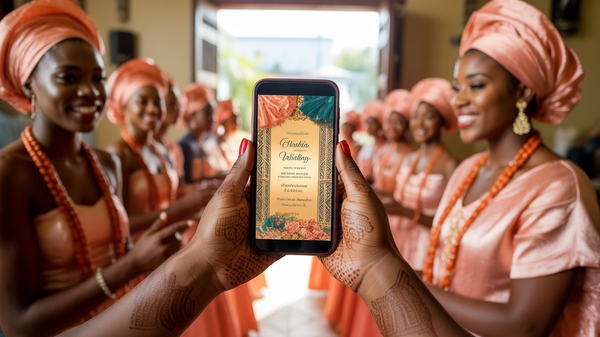
The guests at a 250-person black-tie wedding in Lagos or a 180-person intimate ceremony in Melbourne are forming an opinion about the event before they read the venue name. That opinion comes from color, hierarchy, white space -- and above all, from type. When the letterforms are doing their job invisibly, the guest simply feels: this is going to be something worth attending.
That feeling is not accidental. It is designed.
Wedwebs works with both couples and Wedding Organizers to build digital invitations where every typographic decision is intentional. If you are ready to move past the template and into something considered, explore our design portfolio or start a conversation about your next project.