Dark Botanicals and Gold Foil: The Digital Invitation Trend Defining This Season
Dark botanicals and gold foil are the design pairing defining premium digital wedding invitations this season. The aesthetic signals depth and intention from the first moment a guest opens the invitation.


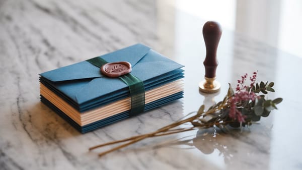
Dark botanical motifs paired with metallic gold foil details are the defining aesthetic of premium digital wedding invitations this season. If you have been drawn to deep, moody greens, near-black florals, and that quiet gleam of burnished gold, your instincts are exactly right. This pairing is not a passing Pinterest cycle. It is a coherent design position rooted in how luxury culture has been evolving for the better part of a decade.
Where This Aesthetic Actually Comes From
The shift toward dark botanicals in luxury design did not begin with weddings. It moved through high-end interior design first, specifically the resurgence of William Morris-era botanical patterns reinterpreted through a contemporary, high-contrast lens. Brands like Aesop and Diptyque were early adopters, using dense botanical illustration on packaging to signal seriousness and depth rather than lightness and whimsy. The fashion world followed, with houses like Alexander McQueen making nature itself feel theatrical and slightly dangerous.
What premium digital invitation design absorbed from all of this is the central insight: darkness in a composition does not signal mourning or formality. It signals depth, intention, and confidence. When a bride chooses a near-black background layered with hand-illustrated botanical detail, she is saying something specific about her aesthetic literacy.
Why the Gold Foil Element Works So Hard
Gold foil in digital invitation design functions the way a single warm light source functions in a dark room. It does not compete with the botanical illustration underneath it. It illuminates specific moments within the composition, pulling the eye toward a monogram, a date, a fine serif initial. The contrast between shadow-rich botanical backgrounds and gold foil detail is one of those pairings that reads as simultaneously ancient and current, which is exactly why it holds up across cultural contexts.
This matters in a globally connected wedding landscape. A design that works as well in a Dubai ballroom context as it does for a garden ceremony in Sydney or a rooftop celebration in Nairobi has genuine staying power. Dark botanicals with gold foil achieve that. The palette is opulent without being culturally specific, which is a harder design problem to solve than it looks.
What This Trend Is Really Doing Emotionally
Here is where I want to be direct with you. The reason this aesthetic resonates with modern brides who have taste is not simply because it is beautiful. It is because it communicates sovereignty. A bright, airy, blush invitation suite is a lovely thing. It is also the path of least resistance, the choice that requires the least commitment. Dark botanicals demand something from a bride. They ask her to trust her own eye over what is broadly popular.
That act of commitment sets a tone for the entire guest experience before a single person has arrived at the venue. When a guest receives a digital invitation in this visual language, something subtle happens. Their expectations recalibrate. They understand, without being told, that this wedding is not going to be generic. That the couple has thought carefully about every layer of the experience. The invitation is doing real emotional and atmospheric work.
How Design at This Level Shapes the Full Guest Journey
The strongest digital invitation design functions as the first room of the wedding. It establishes the mood, the register, the color temperature of everything that follows. When that first room is built with dark botanical illustration, burnished gold foil, and deliberate negative space, it creates an expectation that the physical spaces will honor the same sensibility.
This is why the design choices inside a digital invitation are not decorative decisions. They are experiential decisions. A guest who opens a beautifully composed digital invitation on their phone, where the animation reveals the gold detail as a slow bloom rather than a snap, has already begun attending the wedding. The emotional arc has started.
For a wedding organizer, this is also the argument for investing in bespoke digital invitation design rather than selecting from a template library. Premium guests can read the difference between a template and a commission. Not consciously, but they feel it in the same way they feel the difference between a venue that has been thoughtfully styled and one that has simply been filled.
Wedwebs builds digital invitations at the level this aesthetic demands: bespoke illustration integration, gold foil animation treatments, and a design process calibrated for couples who know what they want and need a studio that can meet them there. If you are drawn to this direction and want to see how it translates into a digital format that carries the full weight of the visual concept, explore the Wedwebs portfolio or bring your references directly to the team.