The Case for Less: Why Restraint Is the New Luxury in Wedding Invitation Design
Restraint in invitation design is not a trend. It is a design position borrowed from luxury fashion and hospitality branding that communicates confidence before a single guest arrives. Here is why it works, and why it matters for the full event experience.

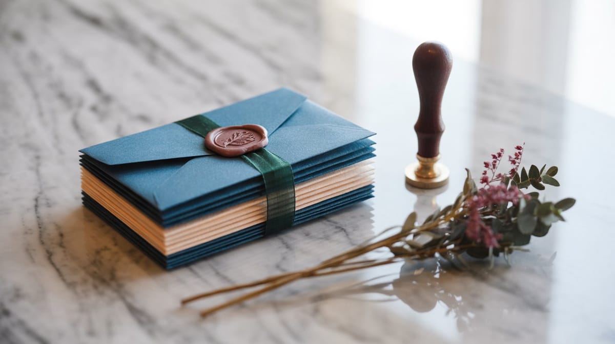
The most sophisticated wedding invitations being designed right now contain almost nothing. A single typeface. A quiet palette of warm stone or dusty sage. Margins so generous they feel intentional. This is not minimalism for its own sake. It is restraint as a design position, and it is fast becoming the clearest signal of premium taste in the invitation world.
Where This Aesthetic Comes From
This direction did not originate in wedding stationery. It arrived there from luxury fashion and high-end hospitality branding, two industries that understood long before anyone else that scarcity of visual information signals confidence.
Think about how The Row presents a collection lookbook, or how Aman Resorts designs a property welcome card. The negative space is not empty. It is load-bearing. It tells the reader: we are not competing for your attention, because we already have it.
That is the exact psychological posture a premium wedding invitation should take. When a guest opens an envelope and sees a card with a single elegant typeface, breathing room, and no embellishment competing for the eye, the message is not 'we could not think of anything else.' The message is 'we made deliberate choices, and we are certain of them.'
Why Restraint Works Psychologically
Design psychology has a useful concept here: cognitive ease. When a composition is visually simple and internally consistent, the brain processes it without friction. That effortlessness reads as elegance. Ornament, by contrast, demands effort. The eye has to navigate flourishes, gradients, layered textures, and competing focal points. That effort registers, subconsciously, as noise.
For a wedding guest, the invitation is the first touchpoint with the event. It sets an expectation before a single venue photo is shared or a dress code is announced. A calm, precise design communicates that the couple (and the team behind the event) knows exactly what they are doing. It creates anticipatory trust.
Conversely, a heavily templated invitation, one with ornate borders, a dozen font variations, and gradient overlays, signals something different. Not warmth, not personality, but indecision. The decoration is doing the work that confident design does not need to do.
The Template Problem
This is where the contrast becomes important. The wedding invitation template market has industrialized ornamentation. Flourishes, watercolor florals, metallic frames, and script-on-script font stacking have become the default visual grammar of the mid-market. They are not wrong, exactly, but they are legible as shortcuts. A guest who attends fifteen weddings a year recognizes a template within three seconds of holding a card.
For couples who want their event to feel like a considered, singular experience, and for wedding organizers who are positioning their services at the premium tier, that recognition is a liability. The invitation has already told the guest that the aesthetic decisions were borrowed rather than made.
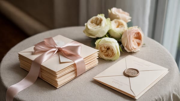
Restraint does not mean cold or sparse. A single warm serif typeface set at the right weight, on a card stock with a tactile surface, in an envelope the color of old linen, can feel deeply personal. The difference is that every element present was chosen, not added.
The Through-Line to the Event Itself
This is where the design philosophy becomes genuinely strategic. An invitation is not just a piece of information delivery. It is the opening sentence of the event's design story.
When that opening sentence is calm, specific, and assured, it primes the guest for an experience of the same quality. They arrive at the venue already oriented toward noticing the details, already expecting a certain level of care in every decision. The florals, the table linen, the lighting all land differently because the expectation was set correctly from the beginning.
A cluttered invitation, however beautiful the venue, creates a gap. The guest carries a slightly unresolved first impression into the room and the event has to work harder to overcome it.
For wedding organizers, this is worth thinking about as a systems question. The invitation is not a separate deliverable. It is the first design decision that every other decision has to answer to. Getting it right, with a partner who understands restraint as a design language rather than a limitation, protects the coherence of everything that follows.
Wedwebs builds digital wedding invitations from this design philosophy outward. If you are working on a project where the visual tone needs to be set with precision from the very first touchpoint, explore the Wedwebs portfolio or reach out to discuss a custom direction.