Why the Best Digital Wedding Invitations Feel Like You Can Touch Them
The finest digital wedding invitations do not look digital -- they feel physical. This post breaks down the specific design techniques that create material illusion on screen, from grain overlays to typographic weight contrast.

The Brain Does Not Know It Is Looking at a Screen
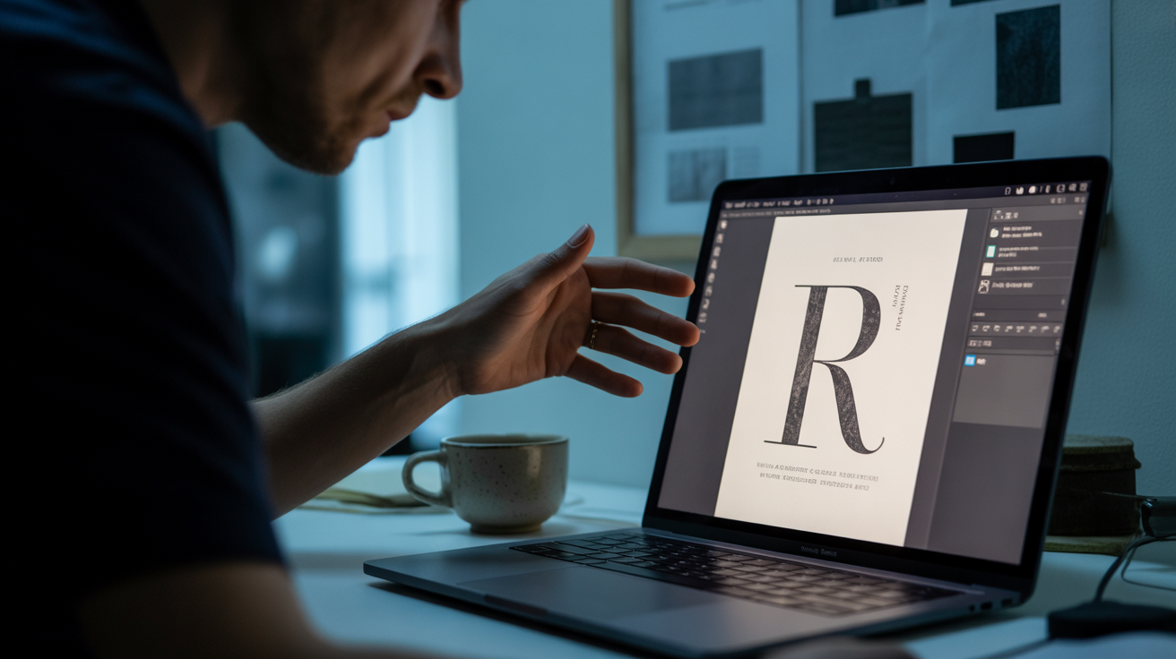
The best digital invitation you have ever seen -- you probably wanted to touch it. That is not an accident.
There is a reason certain digital invitations stop you mid-scroll while others disappear from memory the moment you close the tab. The ones that stay with you are not simply 'well-designed.' They are encoding tactile memory. Your brain, trained by years of handling heavy cotton stationery, embossed letterheads, and engraved place cards, is pattern-matching visual cues to physical sensations. When a digital design gets those cues right, the result is not admiration -- it is longing. You want to pick it up.
This is the deepest challenge in luxury digital invitation design, and most studios never attempt it. They optimize for 'looking beautiful on screen.' Wedwebs optimizes for something harder: feeling like it came from a print house.
The Four Techniques That Create Material Illusion
Material illusion is not one technique. It is a layered system, and each layer does a specific job.
Grain overlays are the most misunderstood. A subtle film grain, applied at low opacity across the invitation surface, does not make a design look old or textured in a literal sense. It interrupts the synthetic perfection of a screen-rendered image. Cotton rag paper, linen stock, uncoated matte -- these materials all have microscopic surface variation. Grain overlays simulate that variation at the pixel level, tricking the visual cortex into registering 'physical object' rather than 'flat screen.'
Shadow depth is how you fake embossing and letterpress without a printing press. The key is restraint and directionality. A single, low-spread drop shadow at a consistent 25-30 degree angle across all typographic and decorative elements creates the illusion that letters and motifs are raised or pressed into the surface. The moment shadows become dramatic or decorative, the illusion collapses. They must feel structural, not stylistic.
Typographic weight contrast is the engraving signal. Traditional engraved invitations achieve their weight through ink depth, not just font size. In digital design, you replicate this by pairing a heavy-set serif in the primary line -- couple names, event title -- against a light or hairline weight for secondary information. The contrast ratio needs to be significant, not subtle. The eye reads that weight differential as depth and craftsmanship.
Negative space is the one most designers intellectually understand but emotionally resist using. An invitation that uses 60-70% of its canvas as white or tonal space does not look empty -- it communicates that the content inside it is valuable enough to not need competition. This is how luxury retail design thinks. It is restraint as a confidence statement.
Three Design Approaches, One Principle
Material illusion can be achieved through radically different visual languages. Here are three approaches Wedwebs works within, each using the same principles through a different lens.
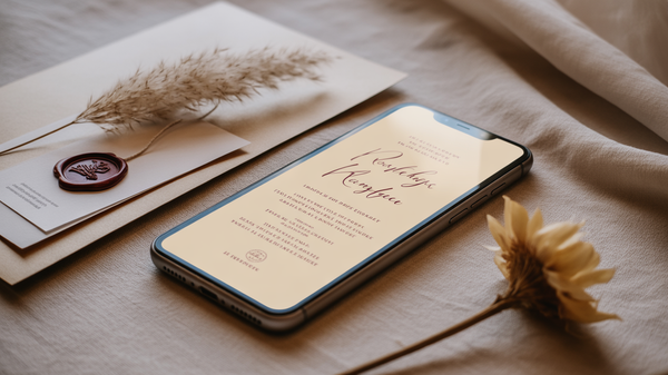
Minimal Luxury strips the canvas to almost nothing -- a single typeface, one tonal grain overlay, zero decorative elements. The material illusion here lives entirely in the typographic weight contrast and the grain. Think an off-white field, a deeply set Garamond-style serif for the couple's names, and nothing else competing for attention. The 'feel' is thick Crane paper. Guests have reported wanting to check if the invitation was paper before forwarding it.
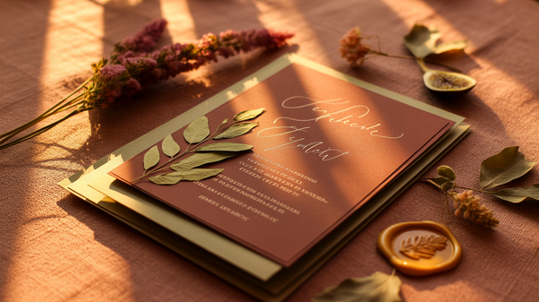
Textured Maximalism does not abandon material illusion -- it amplifies it. Here, the grain overlay is heavier, the background incorporates a muted linen or stone texture, and florals or geometric motifs are layered with directional shadow work to suggest they are printed or pressed onto a physical surface. The negative space rule still applies, but it operates at the section level rather than the element level. Each visual zone breathes; the composition as a whole is rich.
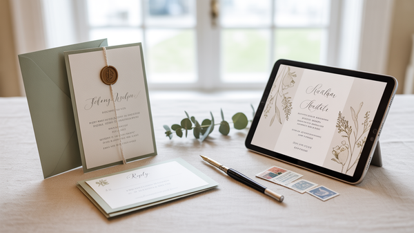
Structured Editorial borrows from high-fashion magazine design -- clear grid structure, typographic hierarchy that reads like a printed program, and a restrained but deliberate use of a single accent color. The material illusion comes from typographic precision and the consistent weight of graphic rules and dividers that feel like they were printed with a Vandercook press. This approach works exceptionally well for multicultural weddings where multiple ceremony inserts need visual coherence across a single digital experience.
Design That Does Not Try to Be Digital
The underlying philosophy is worth stating plainly: the best digital invitations do not try to be digital. They do not celebrate animation for its own sake, they do not lean into hyperlinks as a design feature, and they do not mistake responsiveness for elegance. They try to be felt. Every design decision -- the grain weight, the shadow angle, the typographic pairing, the breathing room -- is in service of one goal: making a guest reach toward their screen.
For Wedding Organizers, this level of design precision is also a business differentiator. A digital invitation that feels premium reframes the entire event in the guest's mind before they arrive. It signals the caliber of the WO behind it.
If you are building a suite of client offerings or selecting a design studio for an upcoming wedding, Wedwebs' portfolio is the place to see what material illusion looks like across different aesthetics, cultures, and scales. Reach out to discuss a custom project -- the conversation is always worth having.