The Color Palettes Defining Early 2027 Weddings (And Why They Work on a Screen)
Brides planning 2027 weddings are choosing palettes right now. These four emerging color directions go beyond dusty rose and sage, and each one is designed to hold its weight on a phone screen before it ever reaches the venue.

If you are choosing colors for a 2027 wedding, you are already behind the curve by about three months. Brides planning ceremonies for January through May of 2027 began pulling inspiration boards six to twelve months before the first guest arrives, which means the palettes shaping those weddings are crystallizing right now, in mid-2026. The window to lead is open. It will not stay that way.
The directions below are not predictions. They are observations from where design culture is moving: in fashion week color reporting, in editorial photography, in the slow drift of what interior designers are specifying for residential and hospitality spaces. Each one translates with unusual precision to the digital invitation format, where a single dominant hue fills a phone screen for three to five seconds before a guest scrolls further. That first impression is the palette's first test.
Glazed Porcelain: The New Neutral with Depth
The blinding, high-contrast whites of early 2020s minimalism are giving way to something warmer and more considered. Glazed porcelain sits between white and the palest celadon, with a faint translucency that reads differently under morning light than under candlelight. The reference is ceramics: Song Dynasty bowls, Scandinavian stoneware, contemporary studio pottery from the Marais district.
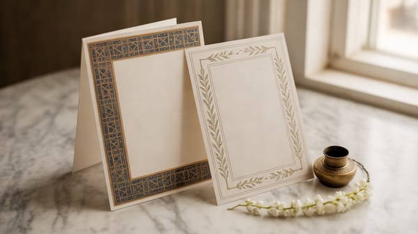
For a digital invitation, this palette earns its place because it reads as luxury without requiring heavy ornamentation. A porcelain background with bone or warm grey type holds attention without fatigue. It also compresses extremely well in web formats, meaning the invitation loads fast and renders consistently across OLED screens and older LCD displays alike. The design does not fall apart when a guest opens it on a budget Android in Lagos or a Pro Max in Dubai.
The cultural moment behind it: a widespread aesthetic correction away from the cold, grey-dominant interiors that defined the previous decade. People want warmth, but they want it restrained.
Oxidized Indigo: Blue That Has Lived a Little
Not navy, not cobalt, not the Pantone-adjacent royal blue that has cycled through weddings three times already. Oxidized indigo is the color of Japanese shibori fabric left in the sun, or a linen suit that has been worn and loved. It carries imperfection as a feature.
This direction is arriving from two directions simultaneously. Japanese craft aesthetics have been gaining serious traction in luxury branding globally, and the natural dye movement in fashion has reintroduced color that appears to have a history rather than a production run. For weddings, it pairs with unbleached linen, dried botanicals, and brass rather than gold.
On a phone screen, oxidized indigo is striking precisely because it resists being identified in a half-second glance. A guest looks twice. That double-take is valuable: it signals that the invitation they are holding is not from a template library. For wedding organizers advising couples on digital design, this palette is a quiet argument for bespoke over generic.
Warm Graphite and Amber: The Evening Palette Done Differently
The combination of warm graphite (think pencil shading on cream paper, not cool charcoal) with amber or saffron accents is emerging as the palette for couples who want drama without darkness. The influence is visible in contemporary hospitality design across the Middle East and Southeast Asia, where hotel lobbies and private dining rooms have moved toward deep warm neutrals lit by amber point sources.
What makes this palette exceptional for digital invitations is the contrast ratio. Amber on graphite meets accessibility standards for text legibility, meaning the design that looks beautiful also functions well for guests with varying visual acuity. A design that is both beautiful and readable is a rarer achievement than it sounds.
Photographically, this palette rewards candlelight and golden-hour coverage. When the wedding day itself is documented, the invitation's palette and the reception's ambient lighting are already in conversation with each other. That cohesion is not accidental. It is what separates a considered wedding aesthetic from a collection of individually nice choices.
Antique Petal: Colour That Remembers Being a Pigment
Distinct from the dusty rose that has been everywhere for five years, antique petal is further from pink than it first appears. It is the color of a botanical illustration from the 1890s, or raw silk before it is brightened. The reference is historical documentation, not romance.
This direction is arriving through the broader cultural interest in archival aesthetics: old paper, pressed flowers, museum light. For digital invitations it is counterintuitive but highly effective, because a palette that reads 'aged' on screen communicates care and curation rather than trend-chasing. It suggests that the couple chose this color because they understood it, not because they saw it on three other invitation designs.
Why the First Screen Matters as Much as the First Look
A digital invitation is not a document. It is the first environmental experience of a wedding. Before a guest steps into a venue, before they see the florals or the table settings, they have spent time inside a color world on their phone. The palette you choose for that screen sets an expectation that the physical wedding either fulfills or disappoints.
This is the design argument that matters most: color consistency from invitation to reception is not a styling detail. It is the architecture of a guest's entire experience. Getting it right at the invitation stage, before any other vendor is briefed, is the single highest-leverage design decision a couple makes.
Wedwebs builds digital invitations that hold that palette with precision, from the first screen load to the final RSVP confirmation. If you are a wedding organizer who wants to show couples exactly what that looks like for 2027, the portfolio is a good place to start the conversation.