The Case for Quiet Luxury in Digital Wedding Invitations
Quiet luxury has moved from fashion runways into wedding invitation design, and the shift is not aesthetic -- it is strategic. Here is what the design choices actually communicate, and when to use them.

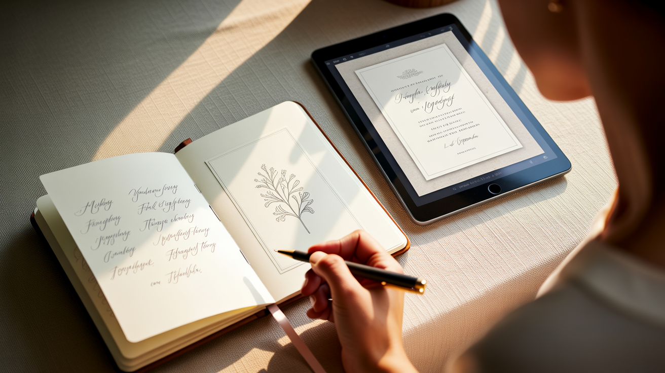
Less Is Doing More Work Than You Think
There is a moment when a guest opens a digital wedding invitation and immediately understands the couple before reading a single word. The font choice did that. The 60% negative space did that. The single hand-drawn botanical illustration rendered in one color did that. Maximalism can impress, but restraint communicates -- and for a specific, growing segment of modern couples, communication is the point.
Quiet luxury as a design language did not originate in wedding invitations. It arrived through fashion -- through The Row, Loro Piana, and Bottega Veneta -- and it built its credibility in spaces where excess was always available but intentionally declined. Then it moved into interiors, where Axel Vervoordt's wabi-influenced rooms and the Scandinavian reduction of Norm Architects reset what 'elevated' looks like in a home. Wedding aesthetics follow culture with about an 18-to-24 month lag. We are now inside that window.
Why Restraint Resonates Right Now
The cultural conditions that made quiet luxury appealing in fashion are the same ones shaping wedding decisions today. After years of maximalist celebration culture -- the sequined everything, the over-the-top content-optimized backdrop -- a segment of couples is deliberately choosing the opposite. Not because they cannot afford abundance, but because the refusal of it signals something more sophisticated: taste that does not need to announce itself.
This is particularly visible among couples in their late 20s and early 30s planning weddings in Sydney, Dubai, Toronto, and London. These are buyers who grew up on Pinterest overload and are now allergic to it. Their reference points are boutique hotel lobbies, Japanese ceramics, and fashion editorials that use a single model, one garment, and a concrete wall to say everything. Their invitation should speak the same language.
The Four Design Choices That Do the Emotional Heavy Lifting
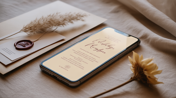
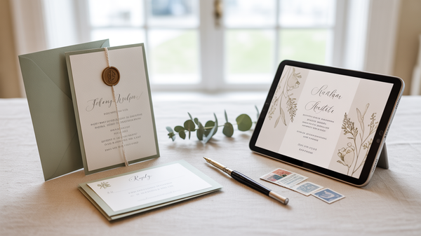
Muted, anchored palettes. Warm parchment, dusty sage, off-white with a single ink tone. These are not 'safe' choices -- they are deliberate ones. A muted palette forces every other element to earn its presence, and it reads as cohesion rather than curation. The guest perceives it as confidence.
Bespoke serif typography. The difference between a quiet luxury invitation and a merely minimal one often lives entirely in the typeface. A purpose-licensed or custom serif -- with deliberate tracking, considered weight contrast between the couple's names and the supporting details -- signals that someone made real decisions here. Generic sans-serifs communicate efficiency. A well-chosen serif communicates intention.
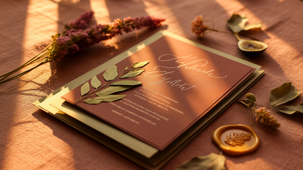
Single-motif illustration. One flower. One architectural line drawing of the venue. One abstract organic form. The discipline of choosing one and committing to it is precisely what gives the motif weight. Repeated across the digital invitation as a thread rather than a pattern, it becomes the visual memory the guest carries into the wedding day itself.
Intentional white space. This is the hardest sell to couples who equate white space with emptiness, and the easiest win once they see it rendered properly. White space is not absence -- it is the frame that makes everything inside it worth looking at. On a digital invitation, generous margins and vertical breathing room signal that the couple's event does not need to compete for your attention. It already has it.
When Quiet Luxury Works -- and When It Doesn't
Here is the honest opinion: quiet luxury is not a universally correct answer. It works when the wedding itself has a coherent aesthetic identity -- a venue with architectural character, a visual direction the couple has genuinely internalized, not just pinned. It works beautifully for intimate weddings of 80 to 150 guests where the invitation is meant to feel like a personal gesture.
It does not work when the wedding is a 500-person multi-day celebration that needs wayfinding, complex schedule communication, and cultural ceremony detail. A Yoruba traditional wedding in Lagos, a Lebanese three-day celebration in Beirut, a grand Indian wedding in Mumbai -- these events have their own sophisticated visual languages that quiet luxury would flatten rather than honor. Restraint applied without cultural literacy is not elegance. It is erasure.
The brief matters more than the trend. A good design studio reads the couple, the event architecture, and the cultural context before it reaches for a single font choice. Quiet luxury is a tool, not a default.
If you are planning a wedding where the design identity deserves more than a template -- or if you are a WO building a portfolio of clients who expect that level of considered craft -- Wedwebs' design team works directly with you to develop invitations that are built for the specific wedding, not built for the aesthetic of the moment. Browse our portfolio or reach out to discuss a custom project.